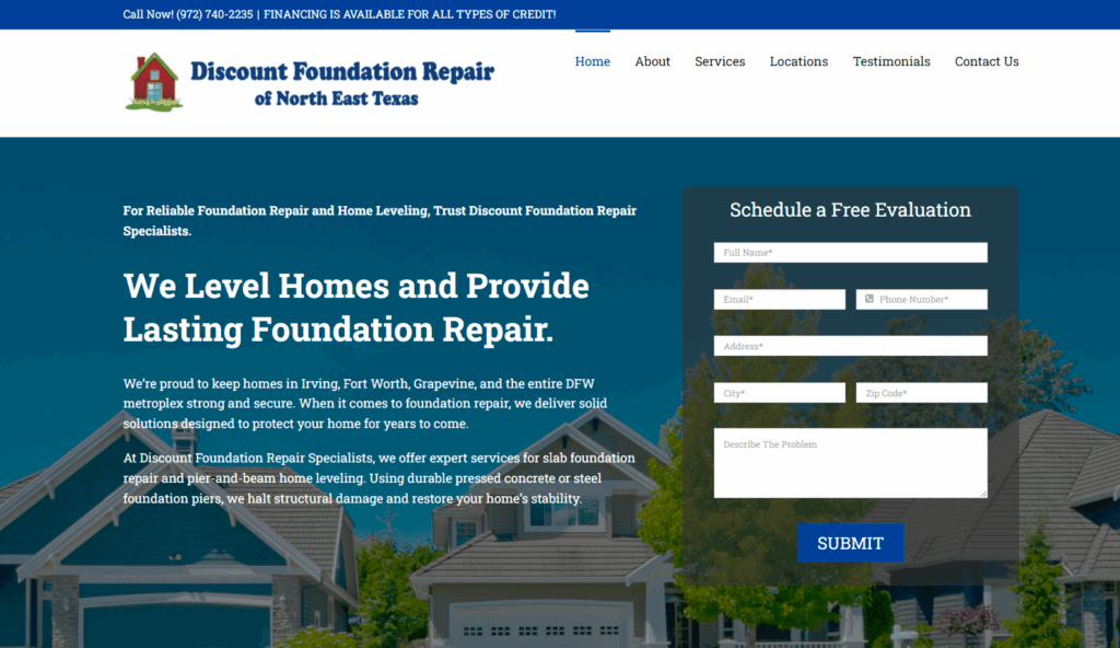
Most business websites look nice but don’t sell. They’ve got cool colors, maybe a video background, even some clever taglines — but they don’t make the phone ring. And if your website isn’t generating calls, leads, and sales, then it’s not an asset. It’s a liability.
Your website’s job isn’t to “exist.” It’s to make money. Period.
The problem is most business owners treat their site like a digital business card. They think, “As long as it looks professional, I’m good.” Wrong. People don’t hire you because your site looks cool. They hire you when they instantly understand the value you bring, believe you can solve their problem, and feel safe taking action.
So let’s talk about the seven principles your website must follow if you actually want it to make money instead of waste it.
Your site has three seconds to answer the only question people care about: “What do you do, and why should I care?”
If your homepage is filled with vague taglines like “Innovating the Future of Solutions,” you’ve already lost. Customers don’t have time to decode your branding exercise.
Here’s what works:
If a visitor can’t land on your site and know within seconds how you can help them, you’re losing money.

Your customers don’t care about your features. They care about fixing their problems.
That means your website should be less about “we use advanced technology” and more about “we’ll fix your leak today before it destroys your kitchen.”
Instead of bragging about services, show how you solve pain. Use real testimonials, reviews, and case studies that prove you’ve solved those same problems for people just like them.
Customers don’t buy the “thing.” They buy the solution. Your website has to show that.
People don’t take action when they feel uncertain. Your website’s job is to kill that hesitation.
That means:
And your calls-to-action? They need to be everywhere — and obvious. “Book Your Free Inspection,” “Call Now to Fix It Today,” not some generic “Learn More.”
The more you reduce risk, the easier it is for someone to click “yes.”
Every extra click is friction. Every second of loading is a chance to lose a customer.
If your website takes more than three seconds to load, people leave. If the phone number isn’t clickable, people leave. If the contact form takes 10 questions, people leave.
Your website has to make it effortless to:
That means fast hosting, clean layouts, and no clutter. Most visitors aren’t there to admire your design — they’re there to see if you can solve their problem and take action. Remove anything that slows that down.
Most websites fail because they try to appeal to everyone. And when you try to talk to everyone, you connect with no one.
If you’re a law firm, your site should look and feel like a law firm’s — professional, authoritative, no fluff. If you’re a restaurant, your site should be appetite-driven, simple, and mobile-friendly.
Generic websites don’t build trust. Niche-specific sites do. Your website should look like it was built specifically for the exact type of customer you serve.
A sloppy site destroys trust. Inconsistent fonts, mismatched colors, random messaging — it all signals amateur.
Customers don’t consciously think, “This font mismatch makes me doubt them.” They just feel it. Inconsistent design erodes credibility. Consistent design builds it.
Your site should look and sound consistent across every page. Same tone. Same typography. Same colors. Same calls-to-action. That consistency tells visitors, “We know what we’re doing. You can trust us.”
This is the difference between winning and losing.
Most websites are digital brochures. They exist to say, “Here’s who we are, here’s what we do.” That’s not enough. Your website has to behave like a salesperson.
That means every page is built to:
If someone visits your site and leaves without calling, booking, or buying, then your site failed.
Every page should push the visitor toward a decision. CTAs should be unavoidable. Forms should be simple. If your site doesn’t close, it’s broken.
Here’s the hard truth: if your website isn’t following these principles, you’re losing money every single day.
And every time that happens, it’s not just a lost click. It’s a lost customer. Someone you’ll never get back.
Redesigning your website isn’t a “nice to have.” It’s an ROI decision.
Think about it: your website is the only “employee” in your business that works 24/7. It never takes breaks. It never sleeps. It talks to every potential customer before you ever do.
But if it’s outdated, confusing, or slow, then that “employee” is turning customers away instead of closing them.
A well-built website, on the other hand, pays for itself fast. If your average customer is worth $1,000, and a better site lands you just one extra customer a week? That’s $52,000 a year in extra revenue.
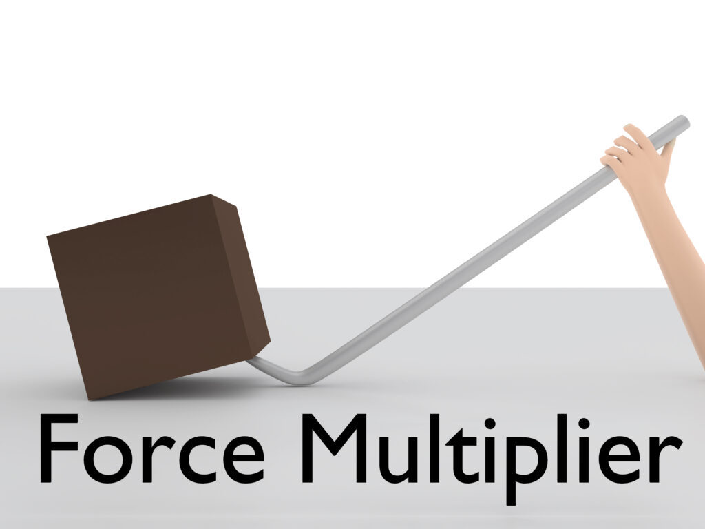
Compare that to the cost of a redesign. It’s not an expense. It’s leverage.

Right now, your website is either making you money or costing you money. There is no middle ground.
If your site is unclear, outdated, slow, generic, inconsistent, or not designed to convert — it’s already sending potential customers straight to your competitors. And while you wait, they’re upgrading their sites, optimizing for speed, and winning the calls, leads, and sales that should be yours.
At Nickel SEO, we don’t build “pretty” websites. We build sales machines. Sites that:
Your website isn’t just a digital business card — it’s your #1 salesperson. The one that works 24/7. The one that talks to every potential customer before you ever do.
So the real question isn’t: “Do I need a new website?”
It’s: “How much revenue am I losing every single day I keep this one?”
Let’s fix that. Let’s turn your site into the tool it was meant to be — a consistent driver of calls, leads, and sales.
Ready to stop leaving money on the table? Let’s build you a website that sells.
We specialize in web design, SEO services, and many other digital marketing services to help businesses attract more customers and increase revenue. We focus on creating effective strategies that drive traffic, improve search rankings, and build trust online. Our efforts are entirely dedicated to increase your sales with results driven and award winning digital marketing service.
Call if you're interested in real results and a real ROI.
9705 Tehama Ridge Pkwy Suite 257 Fort Worth, TX 76177
Monday – Friday, 9:00 am – 6:00 pm
Career Opportunities